
A Multimedia Exploration of the Story of Vulcan, Blending Film, Poetry, Sound, Music, Art and Science
As we developed our branding and online presence, ‘Cradle’ was our nickname, adopted by our whole brilliant team. A key element to this, added into the mix in layers, was our logo design, which was completed by typography based art.
We, most notably Diana, worked on the logo development with the über-typographer and graphic design expert, Will Hill, Associate Professor Emeritus at Anglia Ruskin University in Cambridge. When I first looked him up, Will’s ARU profile lists the following as his research interests: typography, typeface design, visual poetics, type in illustration, and type and printing history.
![]()
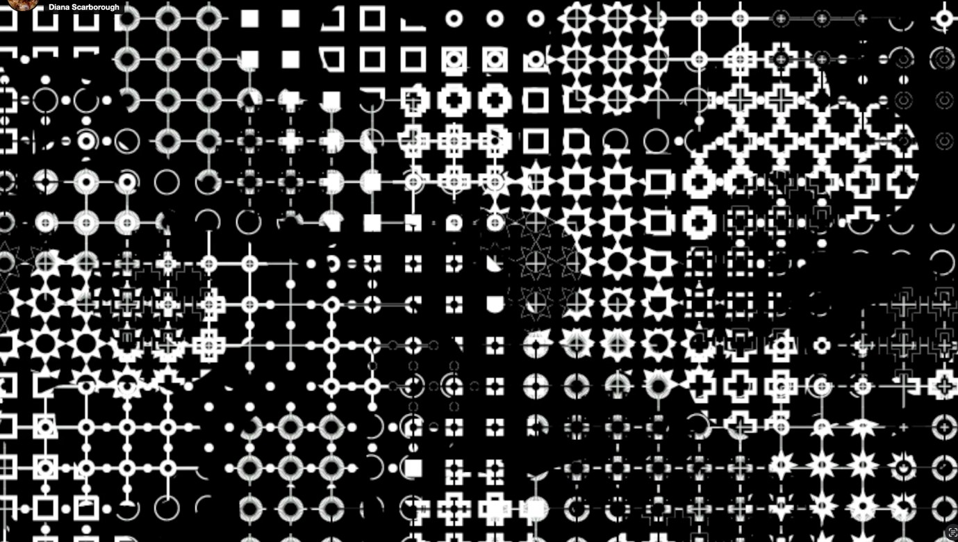
Visual poetry (or poetics?) seems an apt description for what popped progressively into our inboxes as far as I’m concerned. First came, by necessity, Cradle of Fire’s logo for social media graphics, followed by the website graphics, and last, but by no means least, some typographical artworks, designed for each section. These might have further applications, visualised by Diana, as she works on the Cradle of Fire film – we shall all have to wait and see…
Being so enthralled with Will’s output, and drawing from my experience running an arts blog, I was tempted to find out more about his creative process. This led to the interview questions set out below, together with Will’s replies, which I thought might interest the Cradle of Fire’s wider Creative Community.
What drew you to working with Diana and the Cradle of Fire project?
I prefer projects that provide scope for a lot of creative dialogue, and which take my work into directions I wouldn’t otherwise have envisaged. In those situations, the client is a co-participant in the process. Having worked with Diana on several projects since her time on the MA Printmaking at Anglia Ruskin, I knew that we would be able to exchange ideas freely and develop an original concept out of a creative dialogue.
Diana Scarborough and Will Hill’s joint submission for an exhibition about light in Amsterdam, 2017
I believe the initial approach for Cradle of Fire related to creating a logo – how did that evolve?
Many graphic design commissions begin with expectations of a logo, and I find it’s useful to start by questioning that idea – and all the industry stereotypes that go with it – and to work instead toward a visual identity that’s appropriate for purpose. This need not involve a symbol or logotype of any kind. I’m more interested in developing continuity of styling across text, name style and colour, and ensuring that all work together to maintain a recognisable whole.
Can you talk us through the elements that have been created?
The basic logo or namestyle for Cradle of Fire was designed in black and white, set in the semibold weight of my typeface Triforium. Then a multicoloured version was created for use at larger sizes. The same approach was used to create a series of 9 subject headings. This involved the design of 19 multi-layered display capitals; I later built the remaining 7 letters to complete the alphabet.
 Do you think there will be further outcomes and if so, what might those be?
In my initial conversation with Diana, we talked about animation and site-specific projection, and those possibilities were in my mind as I developed the layers that make up each letter. I wanted to create not just a fixed graphic but a flexible set of design elements, to provide a palette or kit of parts that could adapt to different situations and environments. So, the possibilities are wide open; I’ve designed a set of collaborative tools but wouldn’t want to predetermine the ways they might be used.
I may also develop the letters toward a full working font.
What was your initial inspiration in relation to this project?
I’ve found that my work doesn’t usually follow a linear progression from ‘inspiration’ to ‘outcome’. The project gave a context for possibilities I’d been playing with for some time; ideas that were looking for a home, or solutions looking for a suitable problem.
Over the last couple of years, I’ve been working on a typeface family in five weights; more than I had attempted before. This involved thinking differently about the essential structure of a letter and focussing less upon the profile and more upon a central spine, around which the different weights could be built. At the back of my mind while solving these problems, was the idea that the skeleton of each letter could be ‘clothed’ in a variety of different forms, creating multiple styles for different purposes.
When I started to discuss the Cradle of Fire project with Diana, I saw some opportunities to explore this idea further. We were talking about the processes of blacksmithing and foundry work, and I thought of reflecting these in the design of a series of digital ‘brushes’ that could wrap the paths of each letter, and of applying contrasting ‘hot’ and ‘cold’ colours to the different stroke widths.
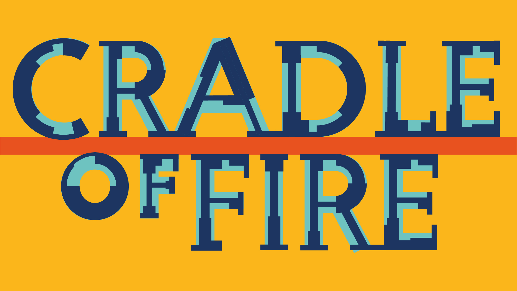
Cradle of Fire social media logo designed by Will Hill
Which comes first, in general – the letters or a vision?
I’ve probably started to answer this above, but I’ll often start by looking a word-shapes and the possibilities they offer; different ways they could align or interlock. This dates back to my work as a book jacket designer in the 1980s and 90s. ‘Vision’ for me is something that develops out of process. I’ve hardly ever started by visualising how I want something to look – and when I’ve attempted this, I usually ended up with something that looked quite different from the result I’d imagined!
Cradle of Fire Fornus artwork by Will Hill © Cradle of Fire
How important is colour in your work?
That’s an interesting question for a typographic designer, since type itself has no colour (though I’ve designed fonts for multicolour use, such as P22 Dichromate). I’m used to working with colour as a semantic tool, to signal different kinds of information.
It’s also an important element of my digital large-format prints, referencing the colour-schemes of different locations or just as a dynamic medium in its own right. In my early work, as an illustrator in the 1970s, I worked in traditional colour media – mainly watercolour and gouache – and I think this has informed the way that I now select and combine colours for digital production.
Would you like to highlight a couple of other creative projects that you have worked on?
I’m not sure if my recent book ‘Space as Language’ counts as a creative project. On the one hand, as part of a series of ‘research monographs’ it’s quite academic, but I’d say that it draws upon my creative thinking and some preoccupations that are central to my work in typography and typeface design. It’s about space in typography, and the idea that the spaces within and between letters, words, lines and margins, are meaningful and constitute a ‘meta-language’. The book is part of the Cambridge University Press ‘Elements’ series, for which I edit a ‘thread’ specifically concerned with typography.
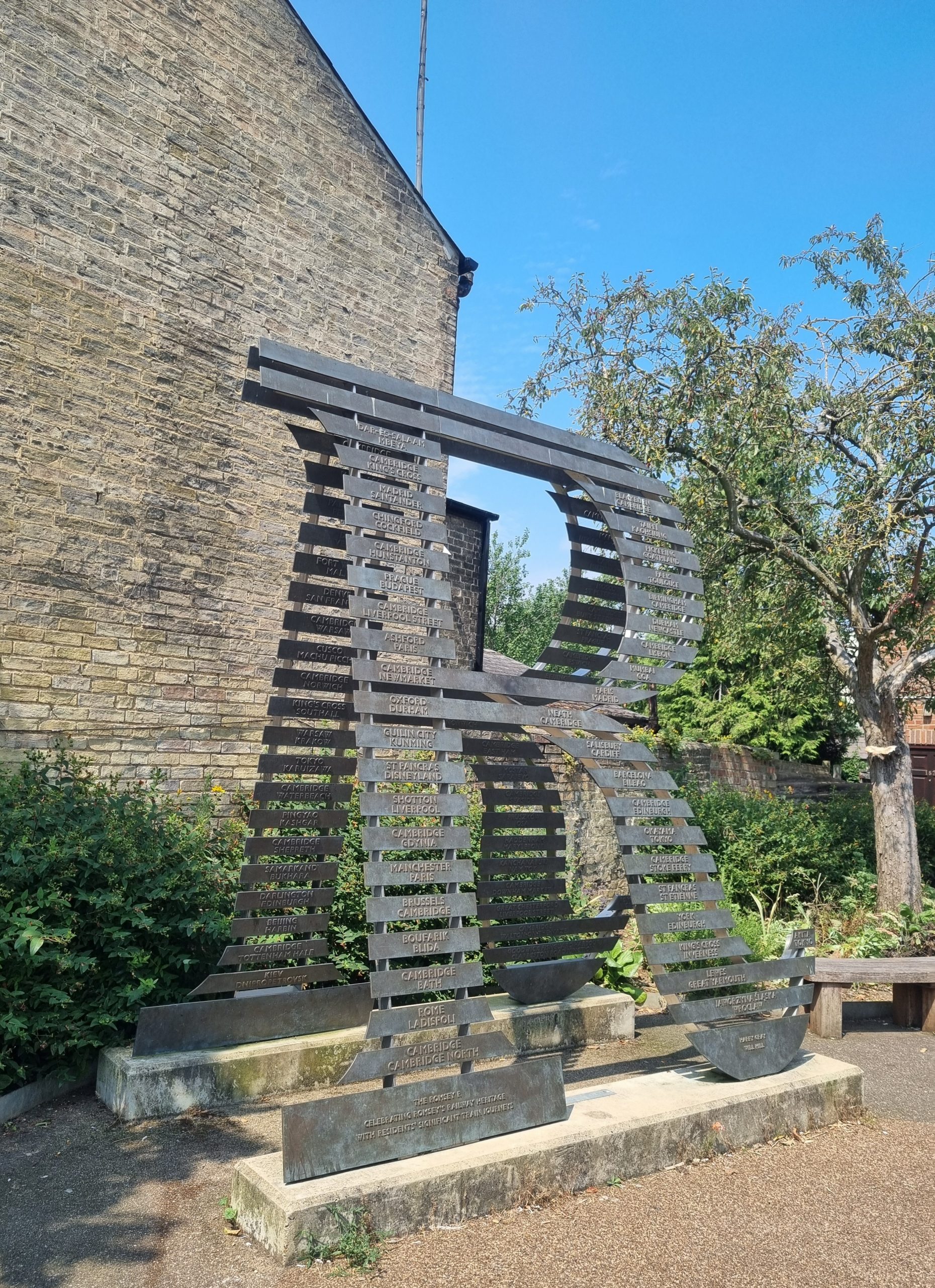
Romsey R, by Will Hill and Harry Gray – visual poetry in the Cambridge community, photo © Emma Boden
The ‘Romsey R’ is a site-specific commission collaboratively developed by the sculptor Harry Gray and myself. It’s a 3 metre high sculpture in steel and bronze, sited at a key location in the Romsey district of Cambridge. It references the past and the future of a neighbourhood closely associated with the railway, both through its structure and its typographic content. It was developed in response to a brief from Cambridge Council and was designed both to celebrate local identity and to provide a placemaking focal point, as a landmark and point of orientation.
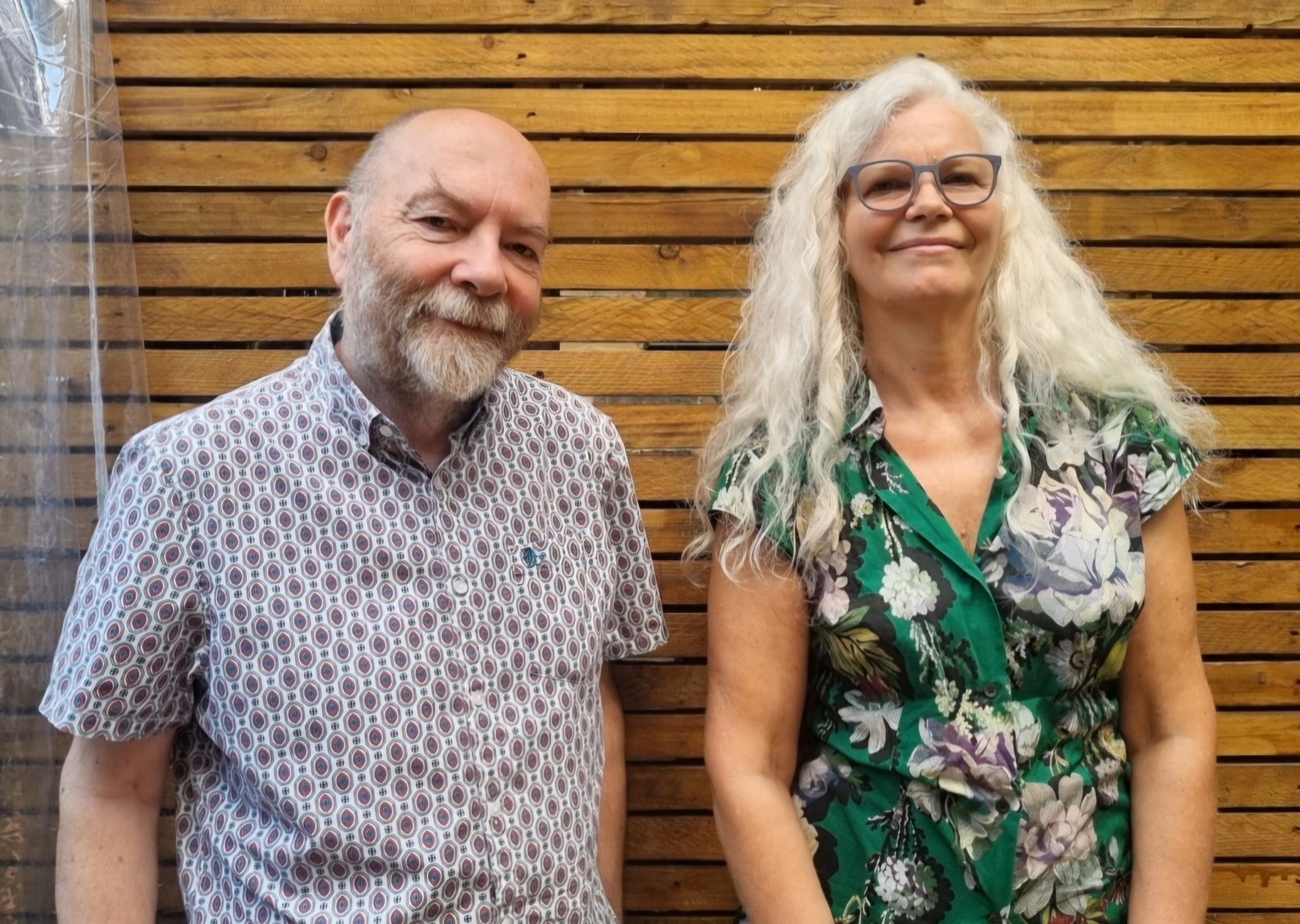
Will Hill and Emma Boden © Cradle of Fire 2024
Find out more about Will Hill and his work.
blog by Emma Boden
We’d love to hear from you as we develop the Cradle of Fire project. Please use the contact page to get in touch.
Cradle of Fire is a research and development project, supported by public funds from Arts Council England. We are also grateful for support from our partners and creative collaborators. Read more on the dedicated About pages.
Check our progress to date and future plans via the timeline